
What we get wrong about colour
Not something just to look at; it's something we live inside. What one architect understood nearly a century ago is only now being explained by neuroscience.

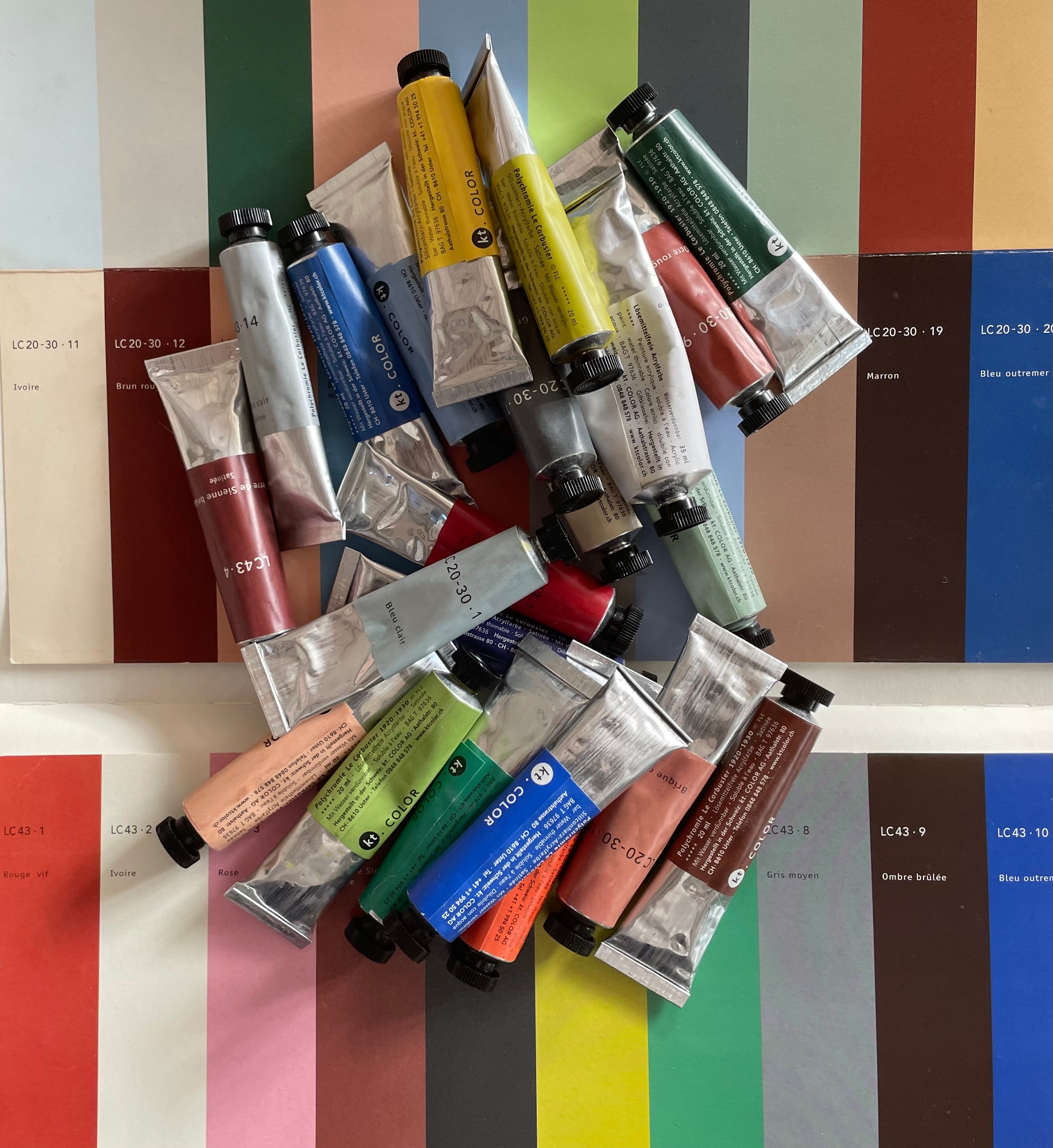
Some years ago, I was sent two beautifully presented sets of 20th Century architectural legend Le Corbusier’s 63 Polychromie Architecturale colours, shared as tubes of acrylic paint. I remember opening the boxes and being mesmerised. Not because the colours were loud or dramatic. Quite the opposite. They possessed an extraordinary quiet confidence. Ochres, mineral reds, soft greens, chalky whites, muted blues, earthy browns. Individually they seemed almost understated, yet together they felt perfectly balanced. Complete. As though every colour instinctively understood its place alongside the others.
I tucked them carefully away. I was too intimidated to use them. They felt like colours that deserved purpose rather than impulse. But in September I’m hoping to give them the attention they deserve as I begin an acrylic painting course (branching out from my beloved watercolour!). It feels oddly appropriate. Rather than choosing colours simply to decorate walls, I want to spend more time understanding them as Le Corbusier appeared to: as relationships, as atmosphere, as a language capable of shaping the way we experience space. Because taking the time to reflect on that palette, one question has kept returning. Why do these colours, created almost a century ago, still feel so remarkably right?
Not merely beautiful. Plenty of old palettes are beautiful. But balanced. Settled. Timeless. I wondered if the answer has less to do with taste than with the human brain.
We tend to think of colour as something we choose with our eyes. A matter of personal preference. Warm or cool? Bold or neutral? Timeless or trendy? Yet our relationship with colour begins long before conscious judgement enters the picture. Long before we form an opinion about a room, our bodies have already started responding.
Light levels. Contrast. Saturation. Temperature. The subtle relationship between one surface and another. These are not simply visual experiences. They are biological ones.
This is why colour has never been merely decorative. It alters our perception of space itself. Pale ceilings appear to lift. Darker ones lower. Walls can seem to advance or recede. Some combinations feel expansive, others enclosing. Certain colours create clarity and orientation; others increase visual noise. We experience these effects physically before we can ever describe them intellectually.
Le Corbusier understood this intuitively.
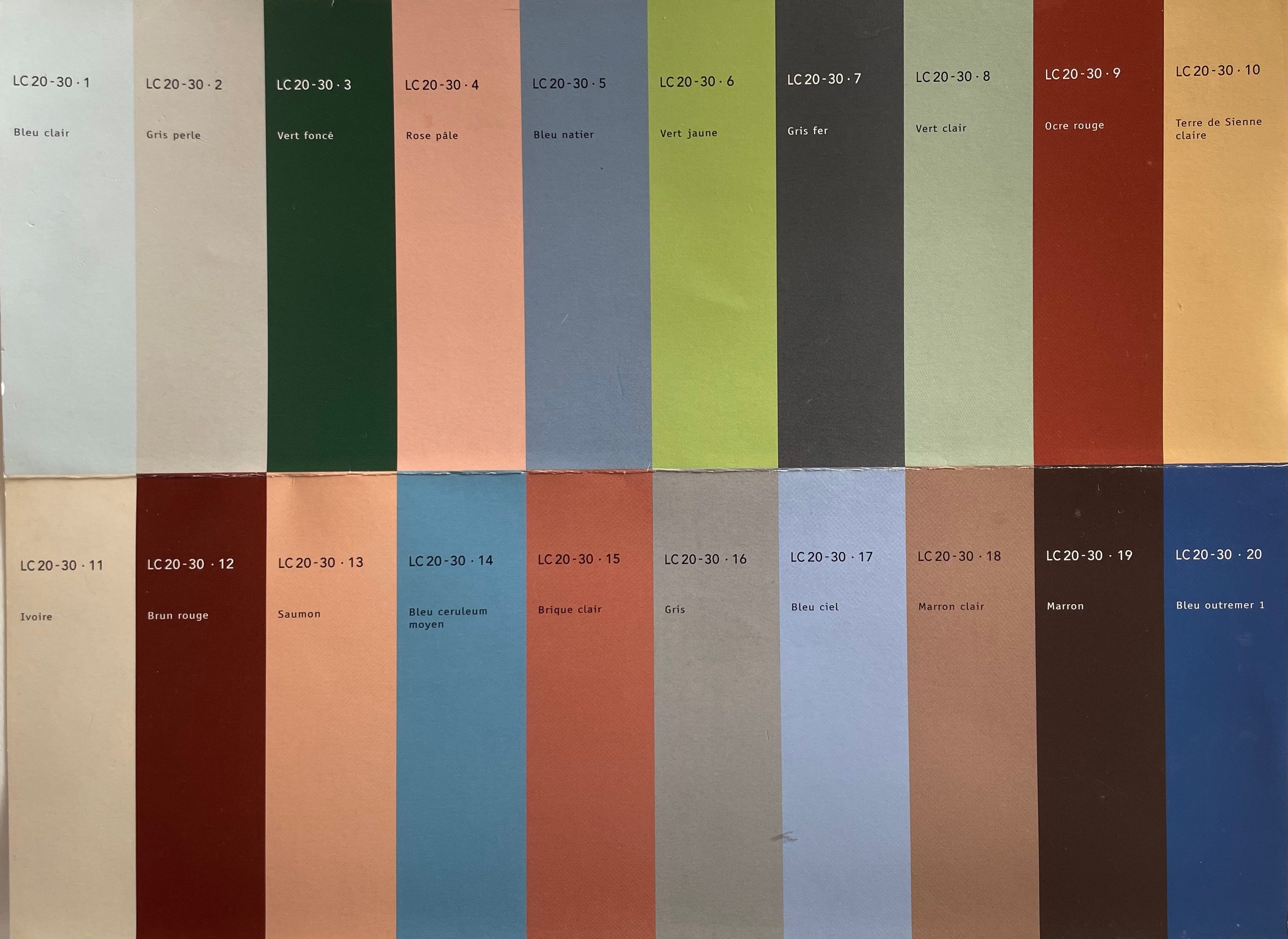
His palette was surprisingly restrained. Rather than offering limitless choice, he reduced his palette to a small family of carefully balanced hues (the first set of 43 quite. subdued colours in 1931, a further 20, more vibrant shades in 1959). Today, this might seem oddly limiting. We have become accustomed to believing that more choice equals more freedom. Paint companies proudly offer thousands of shades, yet perhaps Corbusier recognised something we are only beginning to appreciate again: that abundance can easily become visual overload.
His colours were never designed to compete with one another. They were designed to coexist. Every shade had already been considered in relation to every other, allowing rooms to feel harmonious almost regardless of how they were combined. Rather than demanding attention, the colours quietly supported it. I find that fascinating because modern neuroscience is beginning to offer an explanation for why this works. It’s also what guided my collection of 16 deliberately cooperative hues for Graphenstone.
Michelle Ogundehin x Graphenstone

The Michelle Ogundehin x Graphenstone Collection is an edit of sixteen soothing shades lovingly crafted to be combined any which way you want — they will always work perfectly together. Designed for wellbeing, selected for ease, created for health; it’s a foundational colour palette for your entire home, made simple.
The thing is, our visual system did not evolve inside perfectly white boxes or beneath LED lighting. It evolved outdoors. For hundreds of thousands of years, the human brain learned to interpret landscapes through subtle relationships between earth, sky, vegetation, stone and shadow. Colour carried information. It helped us distinguish shelter from exposure, water from drought, ripening fruit from poisonous berries, morning from evening, changing seasons from stable ground. In other words, our brains evolved reading natural colour relationships long before they ever encountered painted walls.
Perhaps this explains why colours drawn from those same relationships continue to feel so inherently comfortable. Not because green is somehow magically calming or terracotta spiritually grounding, but because these combinations remain neurologically so familiar. They ask less of our perceptual system. They are easier to process. The environment feels coherent rather than fragmented.
This is one reason I have always been cautious of simplistic colour psychology. The idea that yellow makes us happy, blue makes us productive, or green automatically relaxes us has always felt rather too neat. Throw in too how people can be characterised as Summers or Winters with a custom palette to match. I don’t believe in it. Human beings are considerably more complicated than that.
What matters is context.
A colour never exists in isolation. It exists alongside light, texture, proportion, materials, memory and meaning. It exists in relationship to every other colour surrounding it. Perhaps this is why Le Corbusier never treated colour as an isolated design decision. He understood it as part of an entire architectural composition.
Colour made easy

More than anything else, the colours that you choose for your home set its mood music. Colour directly impacts your energy levels, and its associated psychology is a subject that has already filled many a tome. In very simple terms though, colour is emotion. Certain colours can make you feel happy, on edge, calm, quiet, excited or flat and every nuance …
Today we know that our nervous systems are constantly scanning our environments for cues of safety, coherence and predictability. We know that visual clutter increases cognitive load. That harsh contrasts demand more processing than gentle transitions. That environments which feel legible require less mental effort to inhabit. Le Corbusier may never have spoken about cognitive load or neuroception. Those concepts lay decades in the future. Yet much of what he created appears remarkably consistent with what these fields are now revealing.
Perhaps he wasn’t simply designing buildings. Perhaps he was designing perception. For me, this offers a gentle challenge to the way many of us might approach decorating our homes. How? Because we often begin by asking, “What’s fashionable?” or “What’s this year’s colour?” Sometimes we simply search for the perfect shade on social media and hope it translates into our own space. But perhaps there is a better question. Not, ‘What colour suits this room?’ But, What experience do I want this room to create? How do I want to feel when I wake up here? How do I want conversations to unfold around this table? How should my body respond when I finally walk through the front door after a demanding day? Perhaps that’s the real lesson Le Corbusier leaves us. Not that we should all faithfully reproduce his palette, but that colour deserves to be approached with far greater intention than fashion encourages. Because colour is never simply something we look at. It is something we live inside.
If you enjoyed this post, please do hit the ❤️ button - it makes this post more visible to non-subscribers. Thank you!
PS My website michelleogundehin.com makes it easy for you to find everything from my books, the Club, the rugs, workbooks, FREE Home Therapy™ downloads, and my Amazon Shop! After all, ask yourself, What might change if my home became my greatest source of health? I’d love to show you.
Not read this yet as just stumbled on it just now, but seeing the title has me intrigued already! 💖
Love this artikel 💕💙🧡🤎💛🦋❤️🩴☀️🌿