How to 'do' green at home
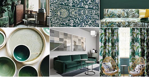
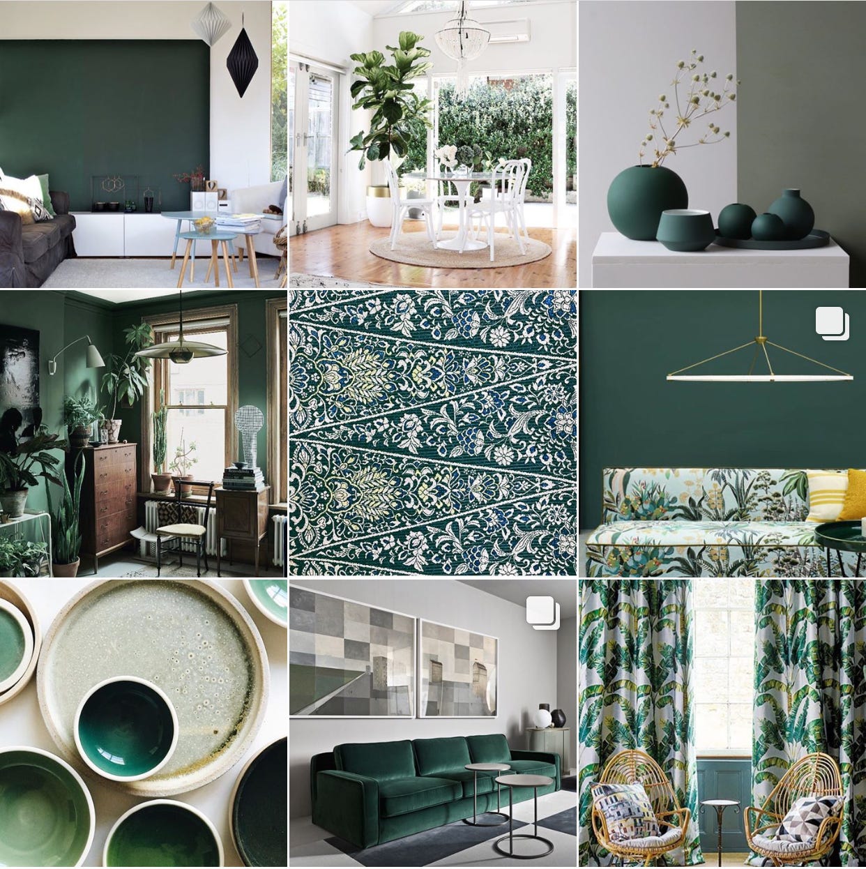
Talking colour here, not eco (for once!) from the best use-anywhere-green to dark fir via warm and dirty sages and a deeply delicious turquoise
From a psychological point of view shades of green recall lush grass, trees and foliage. Because of this we intuitively connect them with Spring, new growth, optimism and rebirth. It’s a visual harbinger of the end of winter, reassuring us that it’s safe for us to come out of our burrows too. It invites us to shed our layers and open ourselves to the outside world. “We are reassured by green on a very primitive level” concurs colour psychologist Karen Haller, “Where there is green, we can find food and water — it equals life.”
As a combination of blue and yellow, green is a unifier of opposites, energising the calm of blue, soothing the intensity of yellow. It inspires us to be both active and peaceful at the same time. It reminds us to appreciate the privilege of being alive.
It also sits at the centre of the colour spectrum making it literally restful for the eyes. In other words, we don’t have to work too hard to see it, so it’s intrinsically calming. It balances our energy so that in looking at it we feel confident that growth is possible. Green reminds us to let go and let nature do her work, while at the same time giving us the energy to do our own.
Studies have also proven that hospital patients facing greenery (whether indoors or out, real or pictorial) recover quicker and need 30% less painkillers. And, looking at the bigger picture, according to author Marianna Popejoy, in her new book At Home with Nature, “living in a green environment helps to build community by bringing people together with research proving that being close to plants and nature can have a positive effect on social cohesion.”
For all these reasons and more, this is why I believe greens are brilliant to use in the home — they speak of collaboration, working best as part of a palette, just as they do in nature. It’s a team-building shade rather than a domineering leader. Eminently tasteful, diplomatic and flexible, it’s a natural comforter rather than a heady provocateur.
Lest we forget though, historically, green also connotes jealousy, decay and sickness. After all, contrast the stealthy allure of a pigment-rich dark fir with the zesty reverberation of a vivid lime. Simplistically put, the former is mixed with more black, thus deepened, slowed and given a sophisticated solidity — less the green shoots of spring than the ancient forests of Scandinavia. And the latter, energised by an overt dollop of yellow, has a shouty, look-at-me absence of subtlety. It calls to mind highlighter pens and sugar-fuelled fizzy drinks!
Both arguably greens, but miles apart in their emotive effect. Choosing the right shade of green for your home is therefore incredibly important!
How I mix my greens…
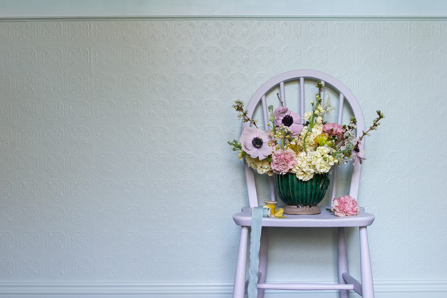
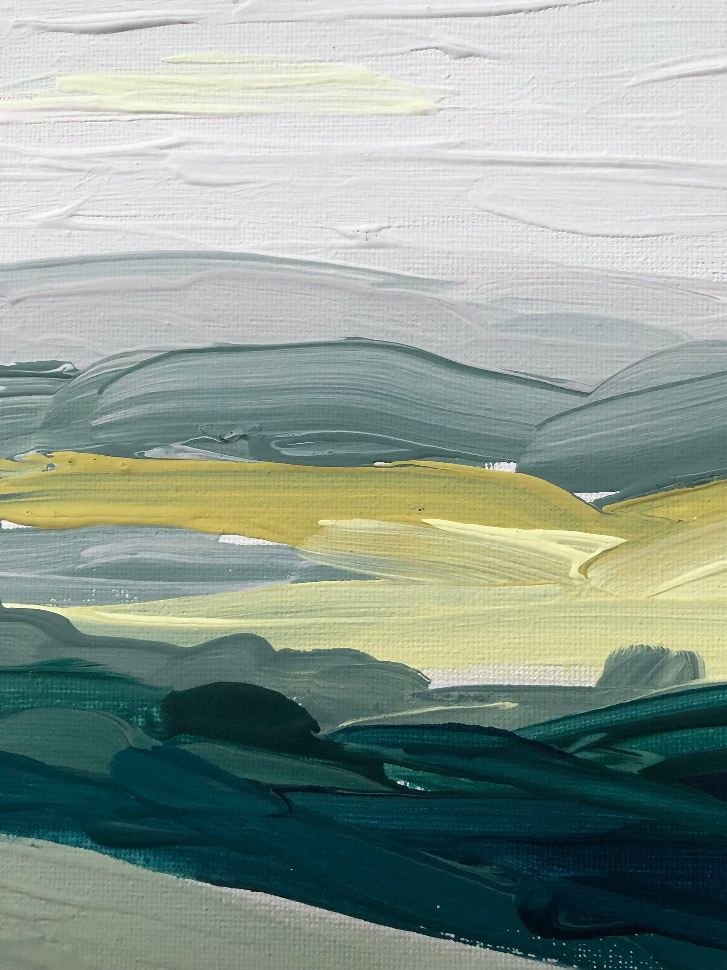
I spent the longest time curating the greens for the Michelle Ogundehin x Graphenstone Collection of eco-friendly paints. They were absolutely the hardest colours to get right. And by ‘right’ I mean so that they worked seamlessly together but offered different feels. In the end, I managed to narrow it down to four (five if you count the turquoise, which I do)!
Easy Green is your new neutral, nurturing and evocative, a truly effortless green. This really is your go-anywhere colour. In my own home I’ve used it in my bedrooms on the main window walls.
Warm Sage: full of character but never overwhelming; it’s your palette heart note. See image below, where I’ve used it above the panelling on my stair landing.
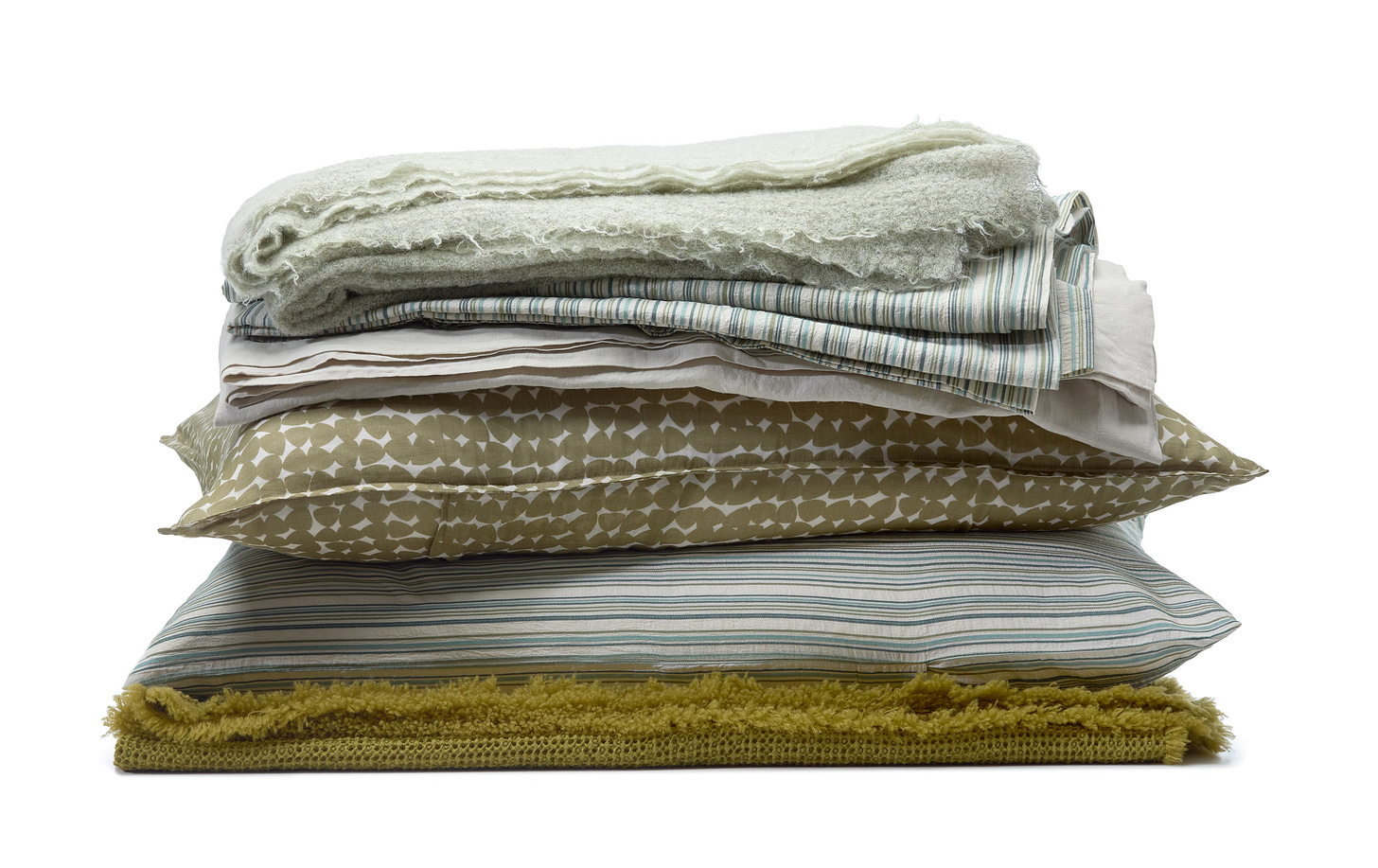
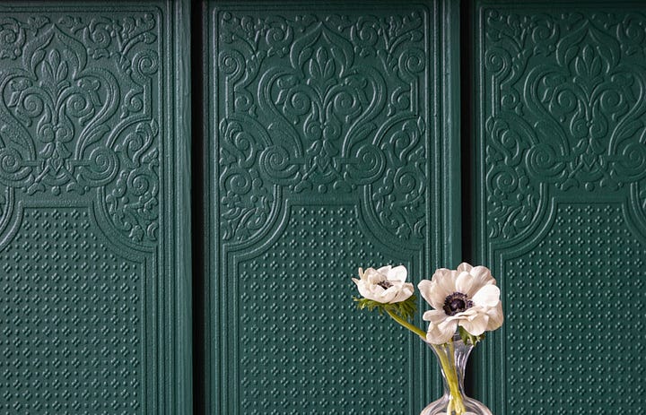
Dirty Sage is soft but strong, the perfect base note to every scheme. Superbly grounding without being dark. See below, used on the textured panelling.
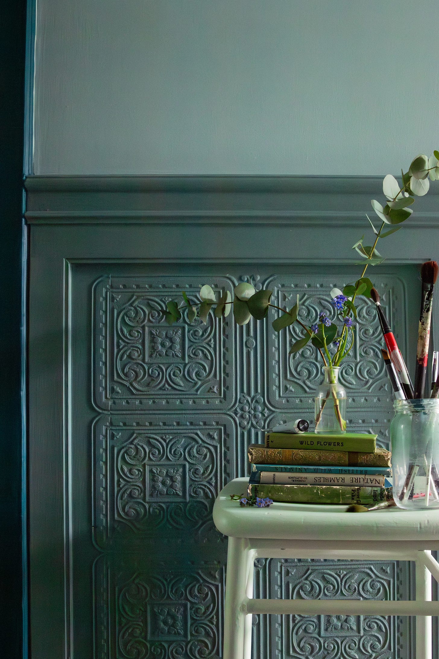
Dark Fir: Think depth with natural richness, a base note of the palette. I’ve used this as above in my study to ground the room across one wall, and also in the lounge, it covers the whole of the back wall that separates the house from the garden. To me, it;s a visual suggestion of what lies beyond! It’s also very cosy-making.
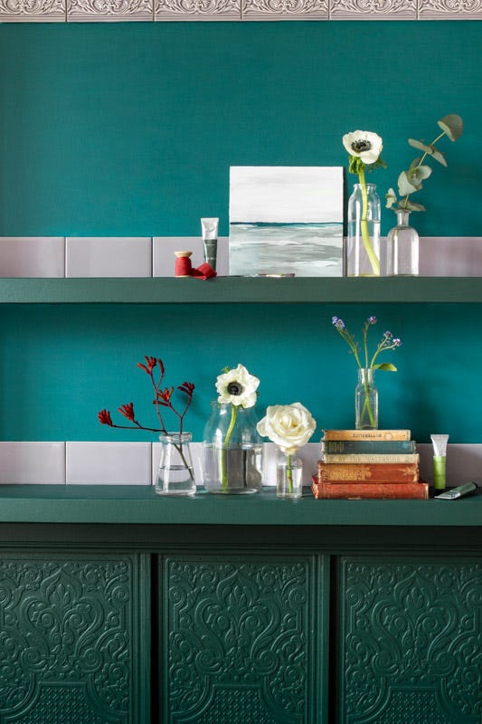
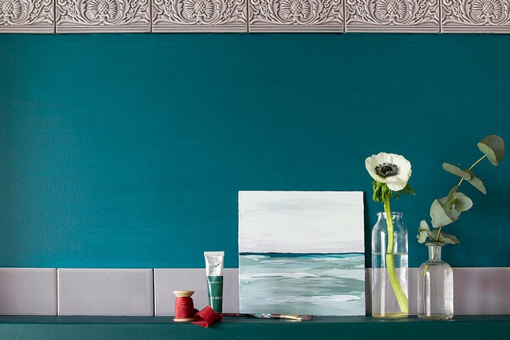
Dark Turquoise: this could sit in either the blue or green camp so I mention it here, because the entire Collection is deliberately designed to be freely mix and matched. And this hue is a deeply sophisticated bright, so it really can be used anywhere. I love it behind pictures or shelving, or in alcoves. I’ve also used it all the way up my stairs!
Michelle Ogundehin x Graphenstone

